CHALLENGE
We all live busy lives, often with more on our to-do lists
than we have time for, or the skillset to take on. Too small for professional help, too big to take on our own. How might we empower people to take on these kind of projects.
Role
UX strategy
Research and analysis
MVP definition/Scope
UX & UI
PROCESS
I broke down our approach into five main phases.
I. Research and Discovery
- Survey, in-depth interviews, competitive landscape
- Analyzed secondary and market research
II. Definition
- Defined and created a north star
- Identified scope, use cases, riskiest
assumptions for MVP
III. Ideate*
- Designed wireflows, information architecture, and
interactions
IV. Design and Prototyping*
- Visual design and prototype to handoff to dev.
V. Testing*
- Leveraged prototype to rapidly test with users
*Iterated designs based on feedback
UNDERSTANDING OUR NEIGHBORS
Research & Discovery
Surveys and Interviews
To gain insight while reaching a larger audience, I designed a 25-question survey and posted it on different online communities and Facebook groups.
Following up from the results of the survey, I conducted interviews in select neighborhoods in the greater Seattle area. These were aimed at deciphering pain points, user attitudes, willingness to engage with neighbors, and potential methods of interaction.
Notable Findings
I learnt that individuals tended to delay home improvement/renovation projects indefinitely, with no strict timelines.
Participants were initially hesitant to approach neighbors for help or to ask for it.
When asked if an incentive would motivate them to reconsider, 100% of our participants said they were willing to engage with neighbors.
This had 3 implications for our product.
Make asking and receiving help effortless so users
wouldn't delayHad to allow for neighbors to easily engage with each other.
Highlight the incentivized model, to motivate them to give and receive help.
Personas
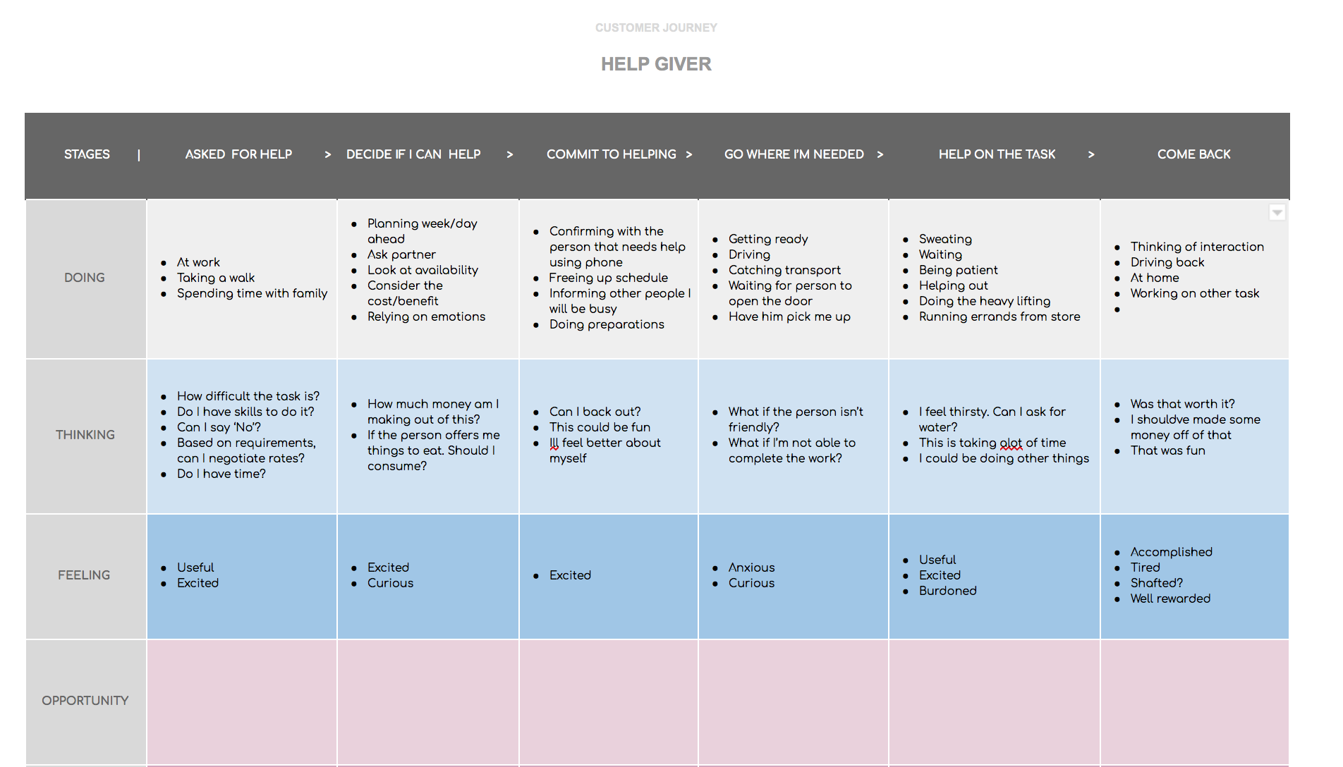
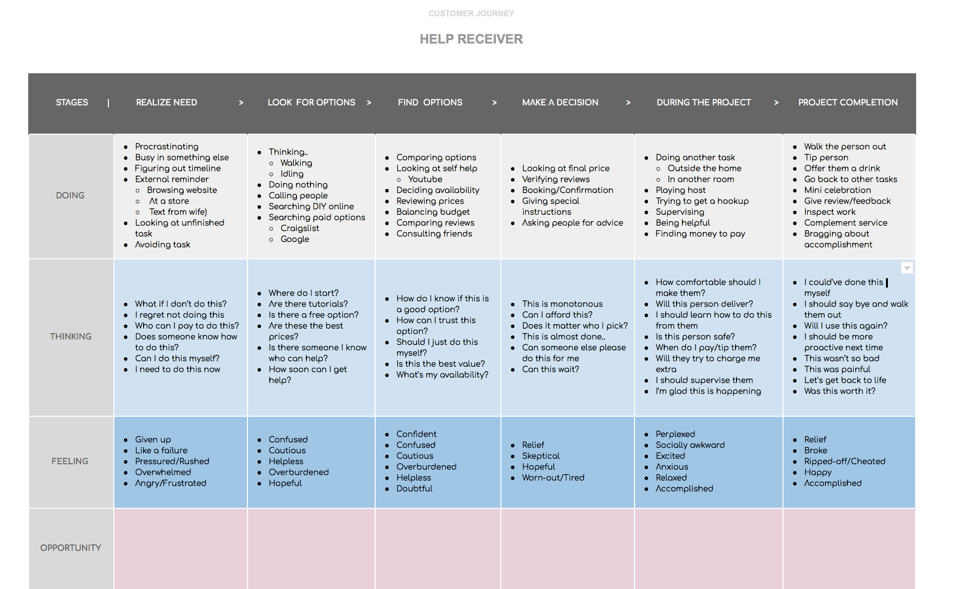
Based on the research, I set up two personas; Jason and Theo. Theo was representative of a "help-giver" and Jason represented a "help-receiver."
Analyzing and distilling the research, I noticed a few pivots that would dictate our personas. Some of those pivots were the time people have (time), urban vs suburban environments. But what made me get clearer on their needs in the moment, is that there was a mindset of someone who tried to help someone for an incentive, and another who needs help in exchange for an incentive.
It was also clear, that quite often, this could be the same person. But it helped mapping their journeys separately to better understand their needs.
Here are some of the opportunities that became clear after journey mapping these users.
Clear depiction of the tasks that somebody needed help on
A way to set and view the incentive
A secure way to communicate with each other to exchange details
Simple ways to create a task a user would need help on
An easy way for a help-giver to acknowledge and accept
a task
CUSTOMER JOURNEYS
Defining a North Star
User Stories
User research and persona creation brought up the users main needs, goals, and behaviors. Therefore, I found that the main issues my design decisions needed to solve were:
Uncertainty about quality and price
Instant help in case of emergency
Ability to review and recommend handymen
Time consumption
User Flows
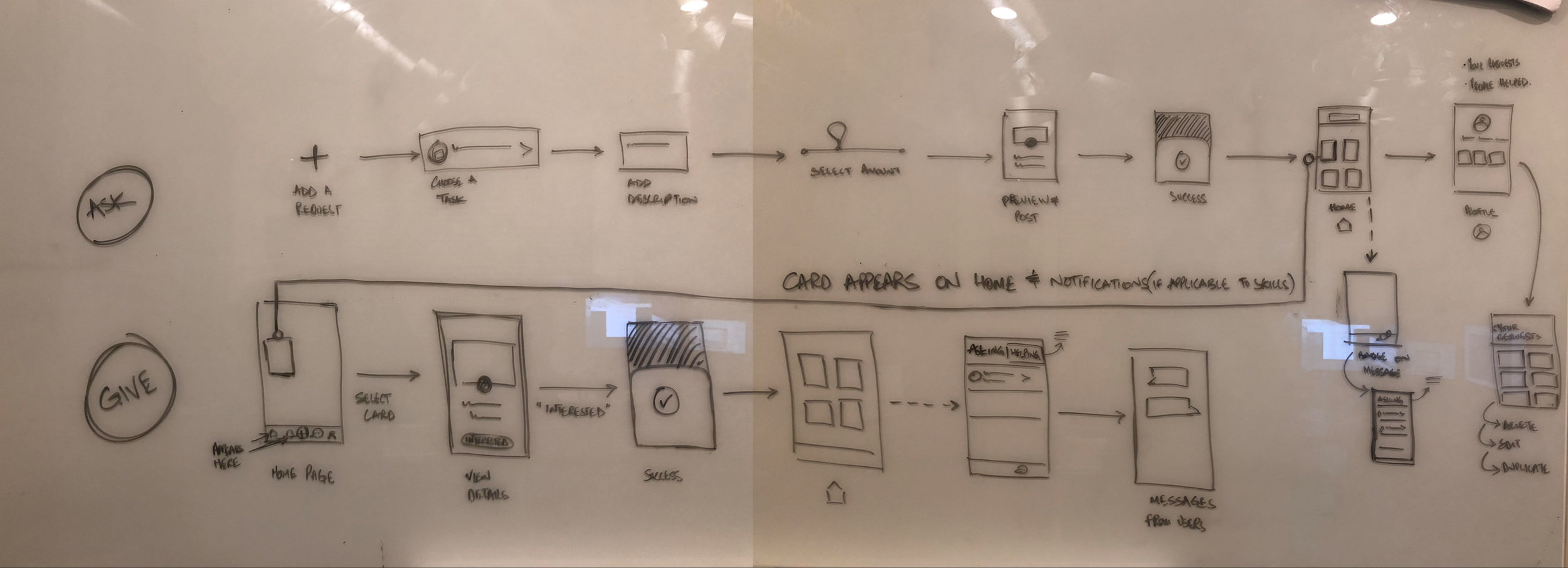
I created a user flow diagram to map every step of the user interaction required to achieve the main goal of this app:
"As a user, I want to ask a neighbor for help.”
Wireflows, IA & Interactions
Low fidelity Wireframes
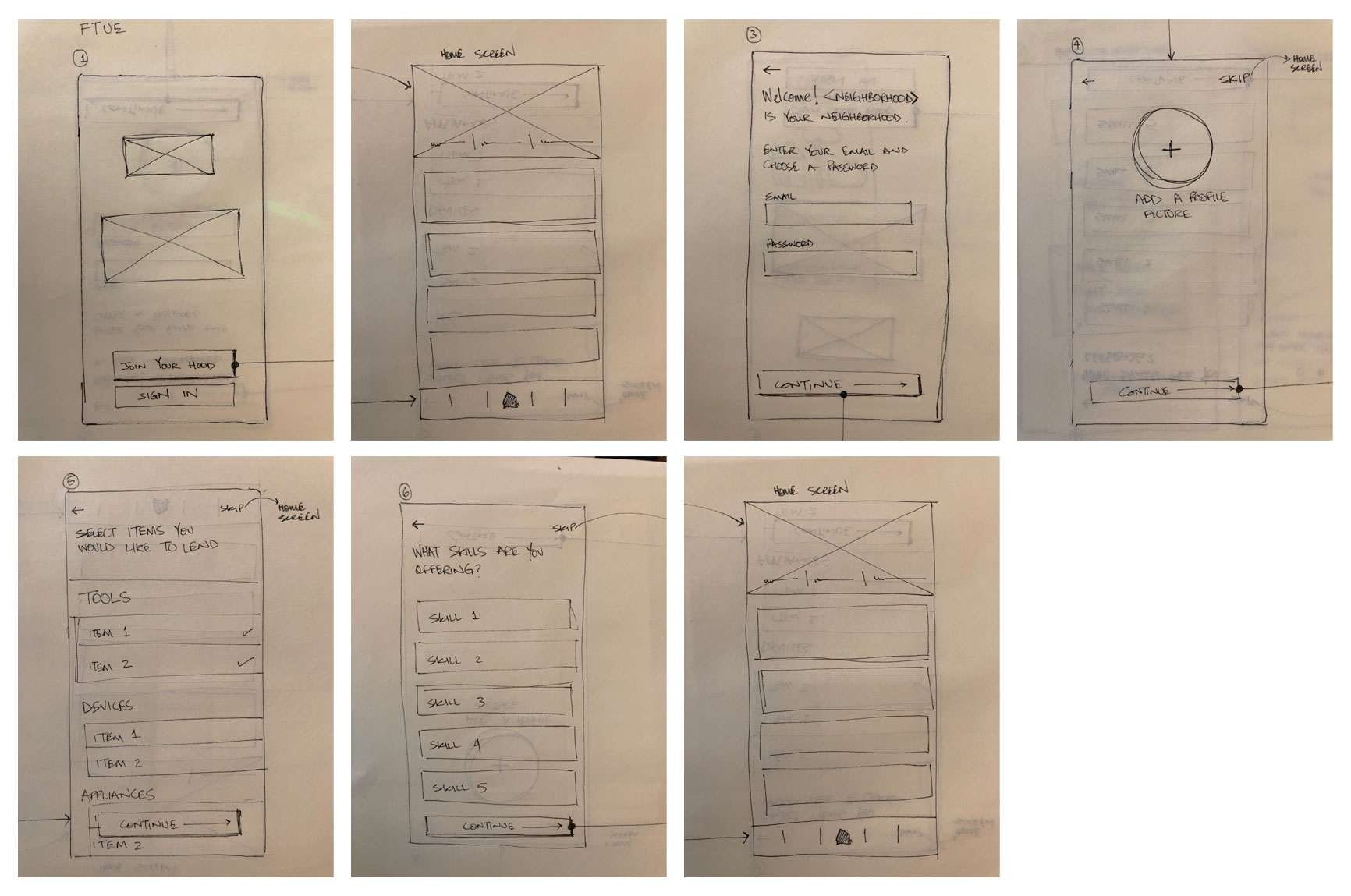
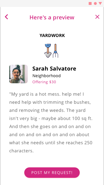
Started diving deeper into individual aspects of the wireframe to see how content and call-to-action would be placed to accommodate an effortless experience.
Created sketches designed to analyze if app was getting to user pain points.
Increased clarity for new users
Designated how user will switch from providing to offering services.
Helped in creating clear early-level prototypes.
Design & Prototype
Design
I turned my revised sketches into a high level early interactive prototype, done with Sketch. I defined UI elements, design patterns and visual hierarchy. I tested the prototype in-person and remotely.
Findings:
Users wanted the ability to filter search results.
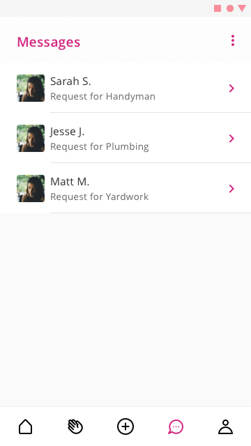
Users wanted the option to chat with neighbor before booking.
Users have missed a label for running work orders that shows the current status.
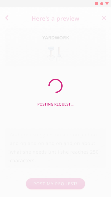
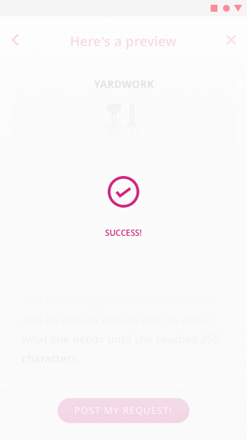
User valued feedback screens after actions.
Design solutions:
A filter option was added to the search results.
A chat option was added to neighbor profiles.
A label displaying the status of each work order was integrated.
VISUAL DESIGN
UI Design
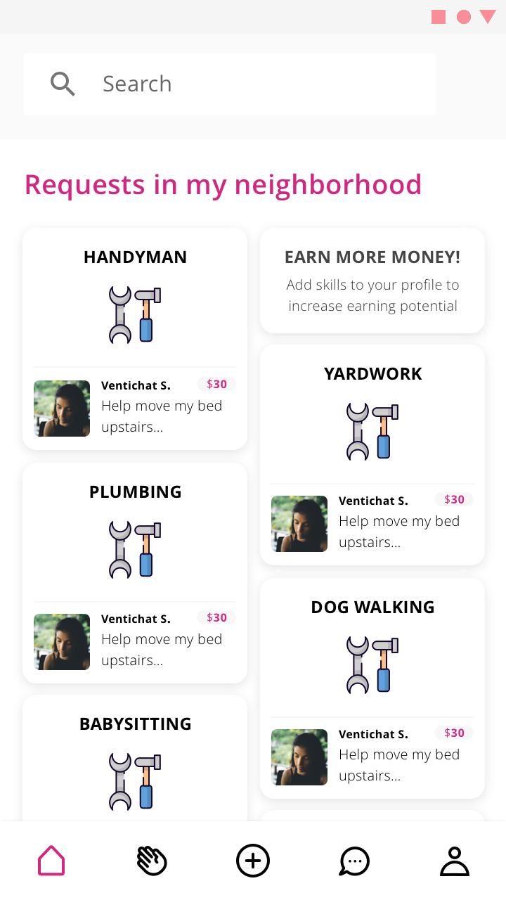
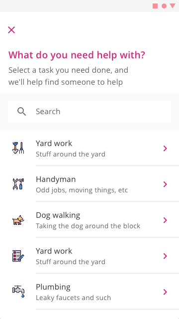
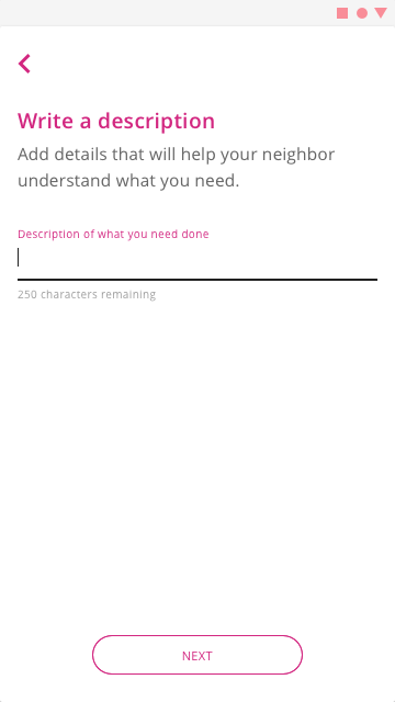
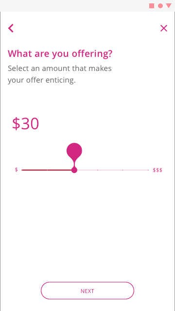
Once I tested out all usability mistakes, I started designing the final screens in Sketch. My visual style is minimal, accentuating white space and using a spark of color— in this instance magenta.
Followed Google Material design guidelines, since the MVP is being built for Android. The color palette I selected was designed to exude a feeling of freshness and friendliness.
Testing and Iterating
Tested and iterated numerous times using the clickable prototype. Aspects that required more clarity was informing customers that this one app was capable of facilitating users in both, receiving and offering help.
Moving Forward
Go to Market Strategy
I'm working on a Go-to-Market strategy targeting particular urban neighborhoods based on user attitudes I learnt about through the research.
Further A/B testing will be required to hone in on the most responsive user base.
Those learnings will be then implemented back into design iterations for further versions of the app.


